Foreword
Project Overview
Challenge
To create an app in the area of mental and emotional health, that solves a real human need and provides an excellent user experience.
Result
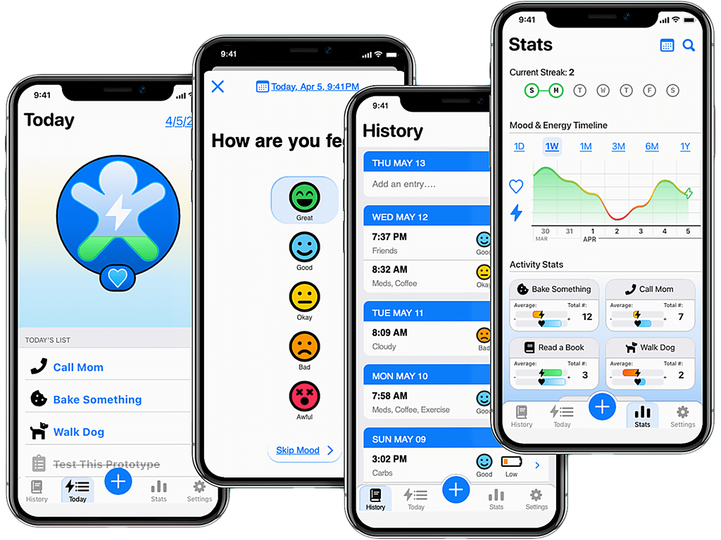
A flexible, encouraging app that allows users to track their mood, energy, and daily activities for the sake of personal insight and growth.
Role
This was a Solo Project—
I was responsible for the Research, Data Analysis,
Prototyping, User Testing, UI Design, and Design
Documentation.
Tools
Design:
Adobe Illustrator • Adobe Photoshop
Prototyping:
Adobe XD • Axure • Invision • Balsamiq
Research & Testing:
Zoom • Google Workspace
Chapter 1
What's the Problem?
Empathize • Define
Soul Units began with a very open-ended request: create a mental and emotional health tool for 25-34 year olds.
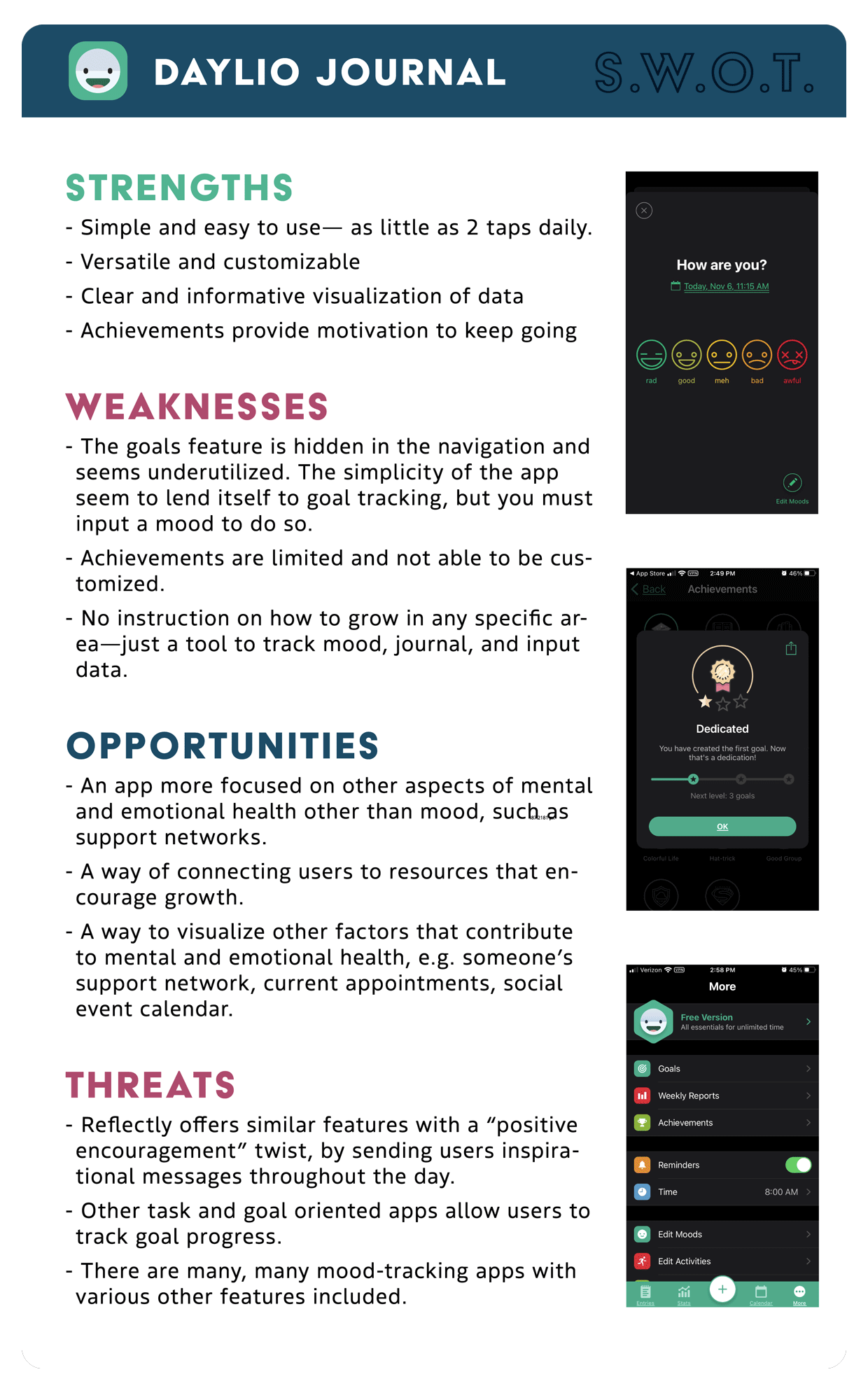
Any successful project needs clear parameters, so I jumped right into defining the initial direction with exploratory research—COMPETITIVE ANALYSIS, USER INTERVIEWS, and SURVEYS.
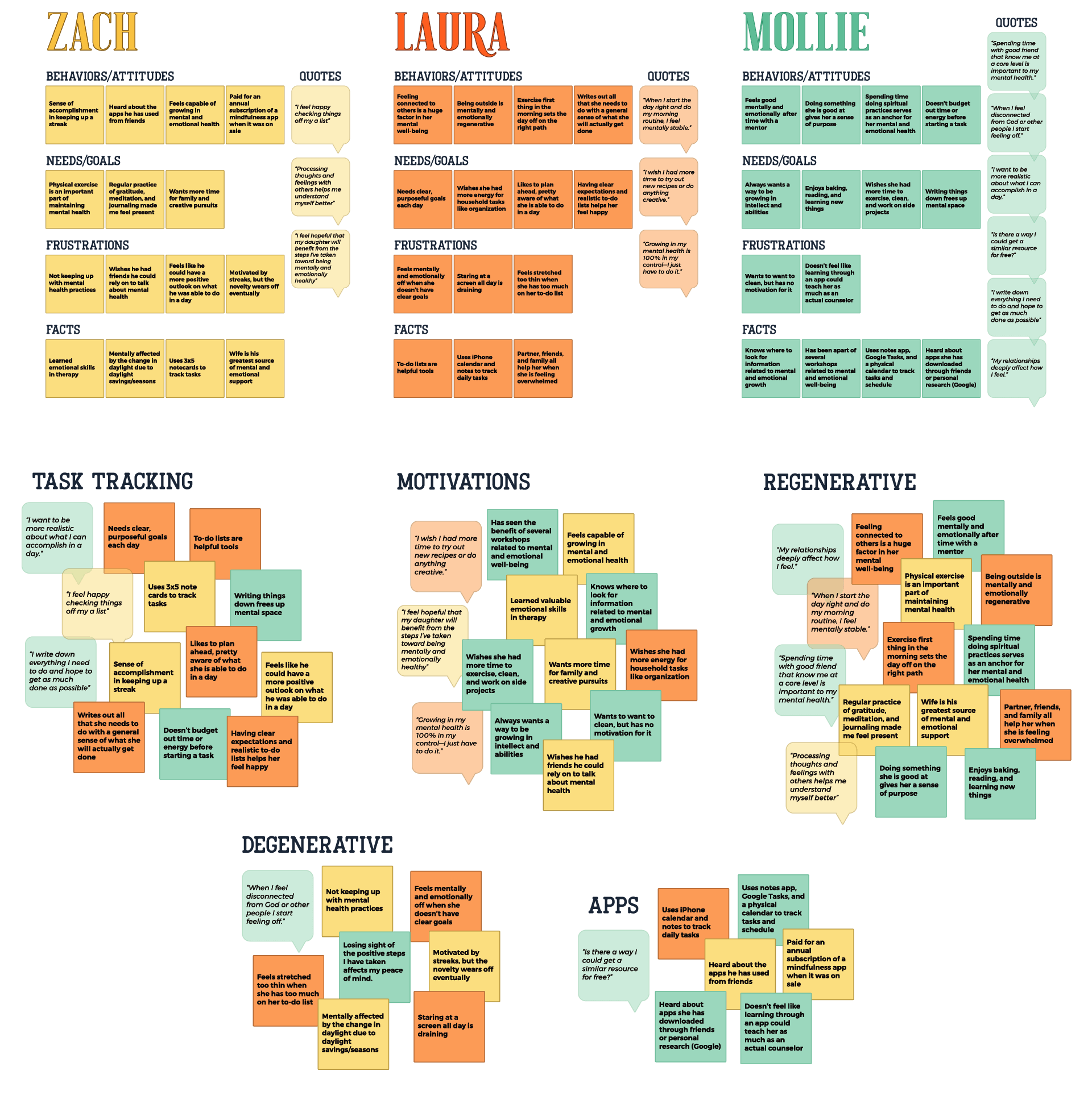
Interviews were organized and then analyzed using AFFINITY MAPPING. This helped me identify trends and discover what people were looking for in a mental and emotional health application.
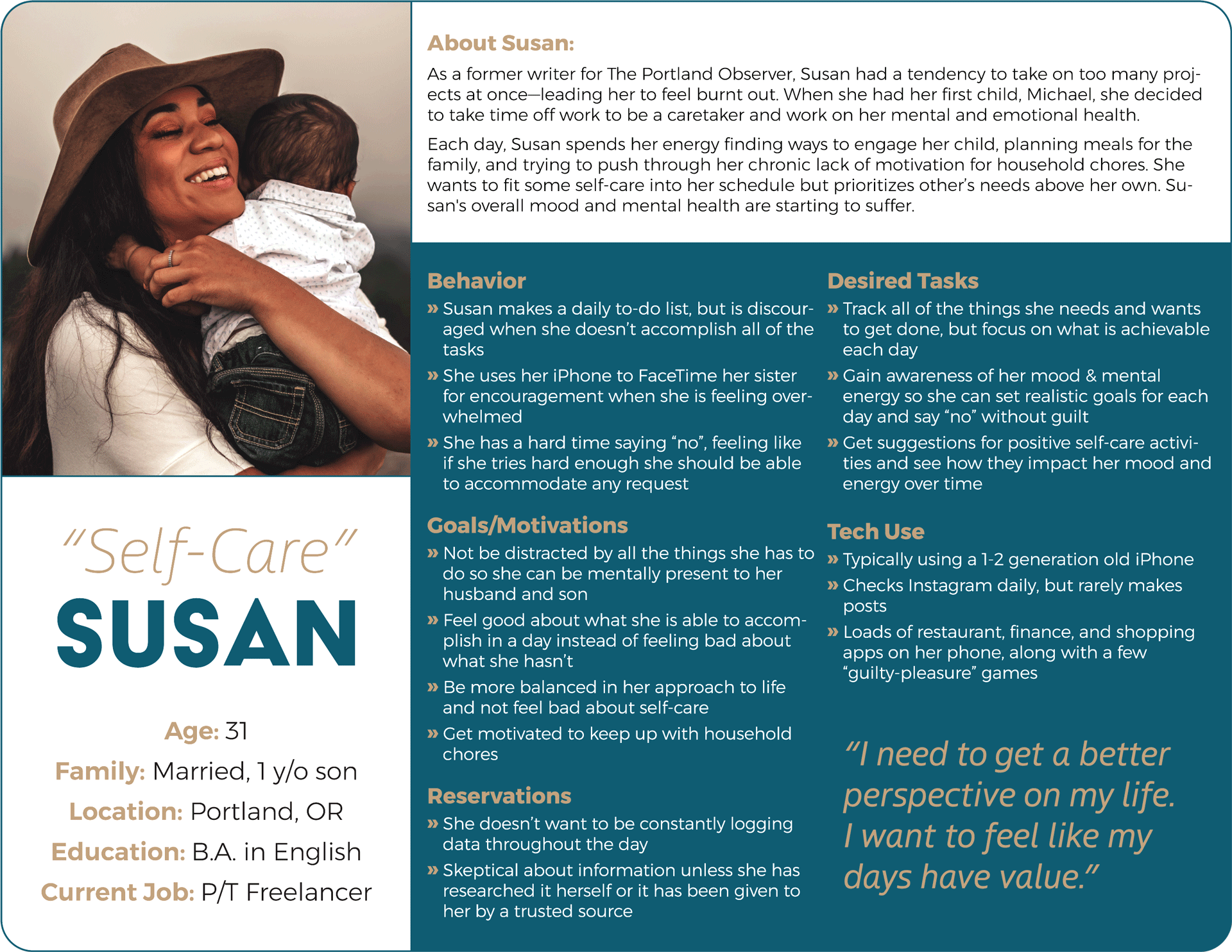
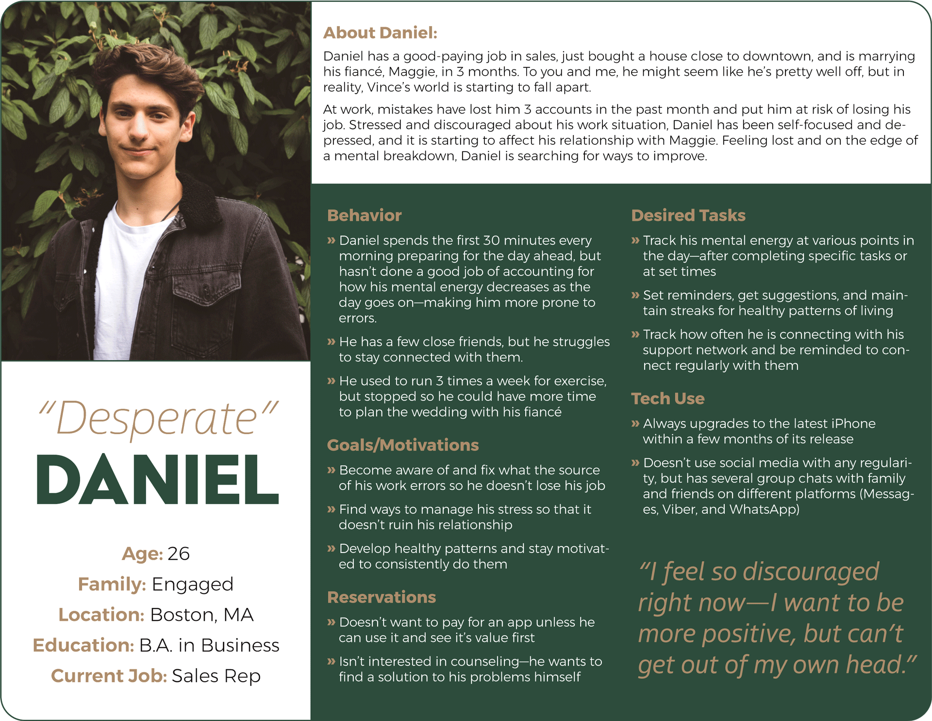
The insights gleaned from research were then compiled into a set of DESIGN PERSONAS to provide vision, empathy, and clarity to the design and development process.
I referred to these personas often, taking care to design for the people who would actually use the final product.
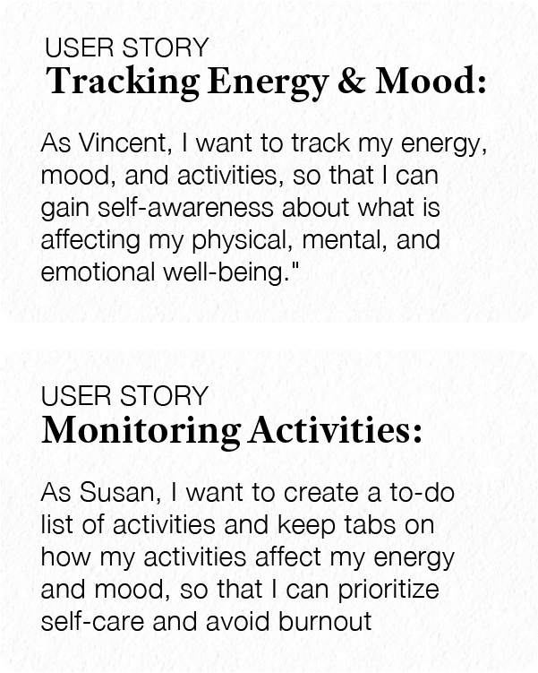
Equipped with an understanding of the target audience I crafted USER STORIES from the Agile methodology to clarify the tasks that needed to be fleshed-out and tested.
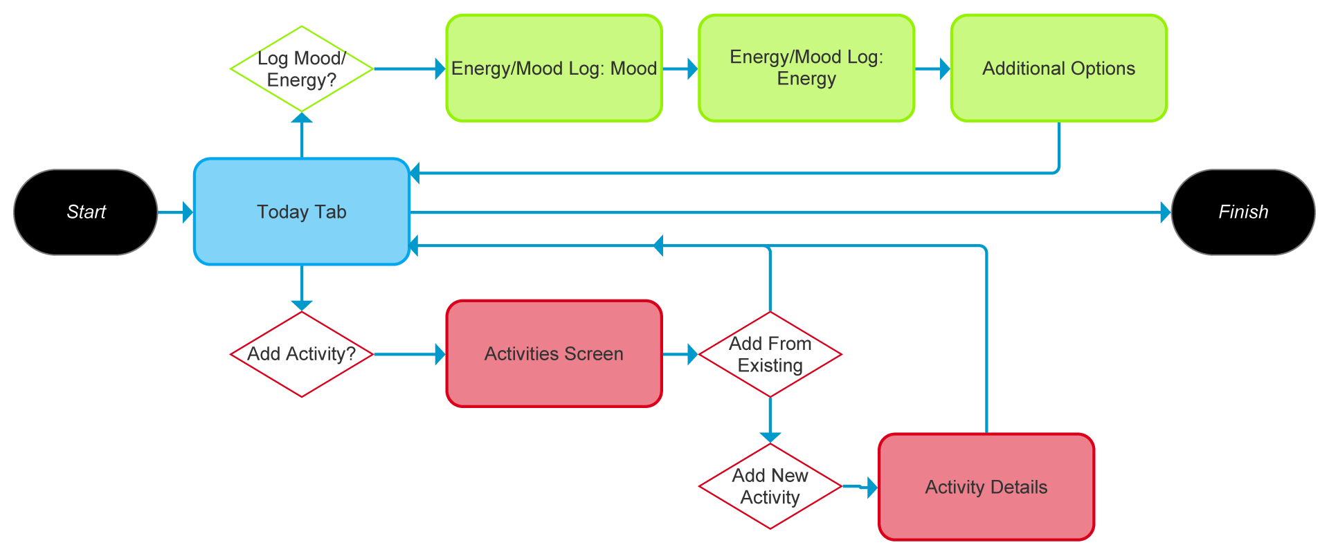
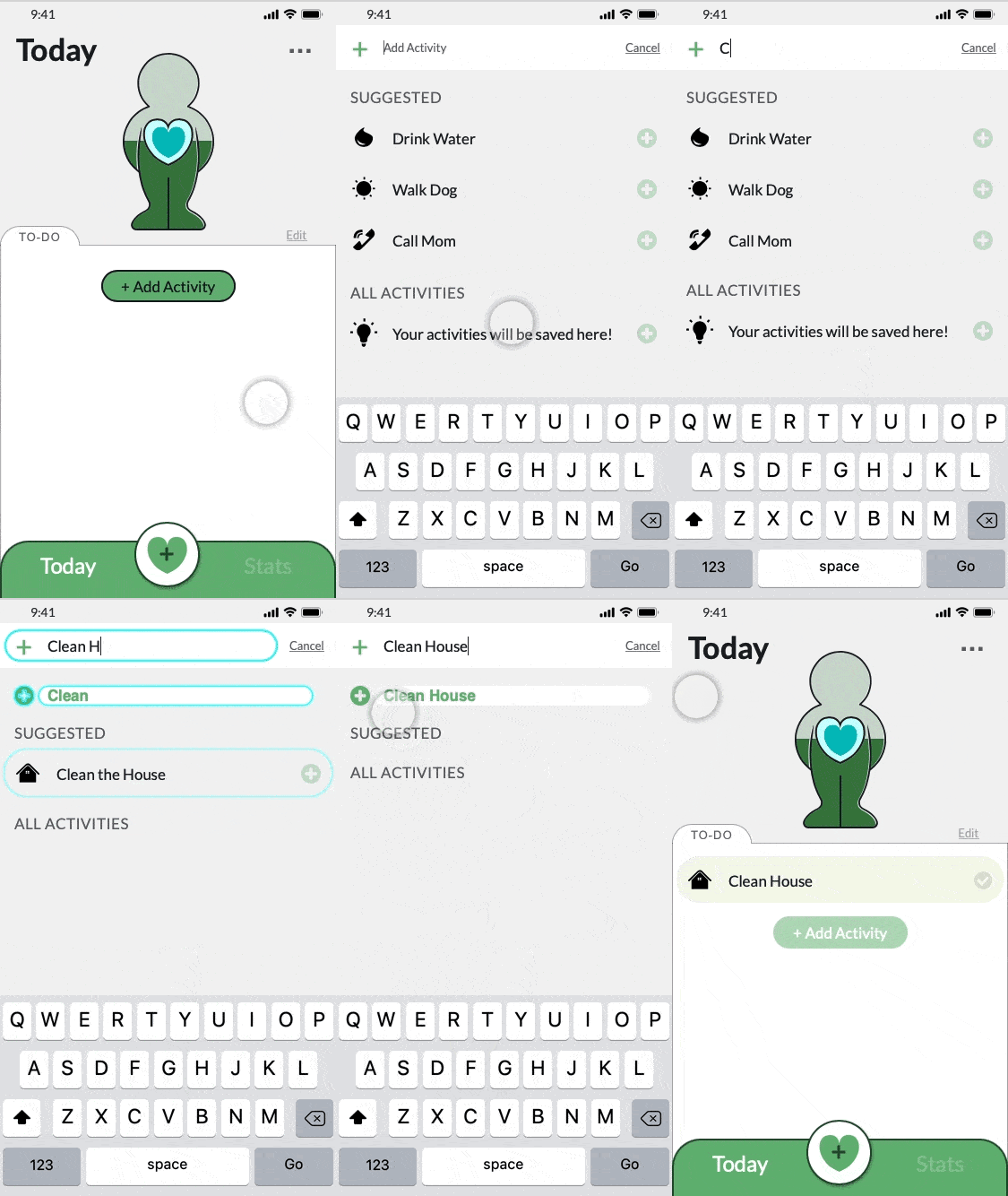
To think through how to navigate through these tasks, I created USER FLOWS:
Flow: Daily Entry
Entry Point: Opening the app
Objective: Make an energy/mood entry and an activity list for the day ahead
Success Criteria: Energy/mood have been logged and activity list has been created
Chapter 2
Dream, Build, Rebuild
Ideate • Prototype • Test
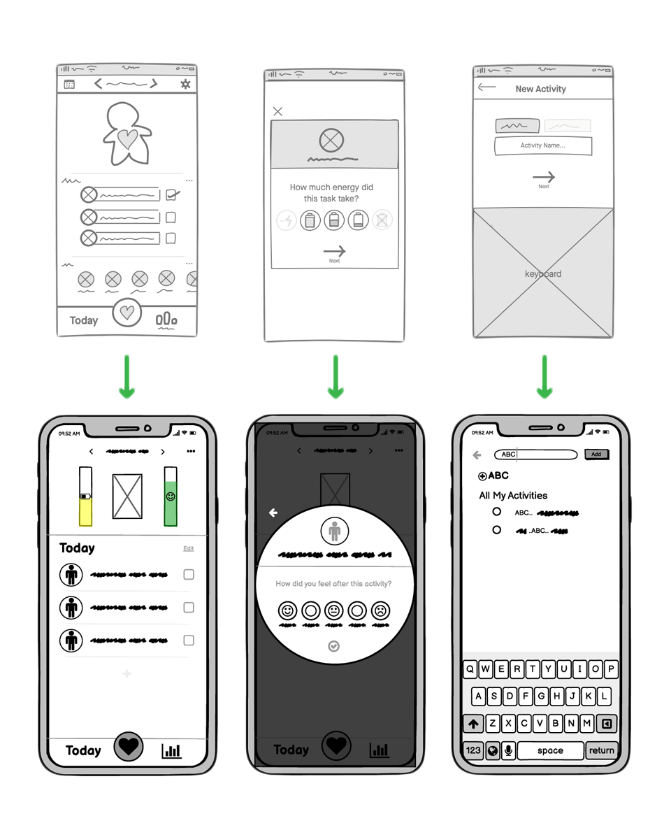
Once I had an understanding of the people who would use Soul Units and what they needed the app to do, I started sketching ideas.
The most promising sketches were then converted into LOW-FIDELITY WIREFRAMES for internal review.
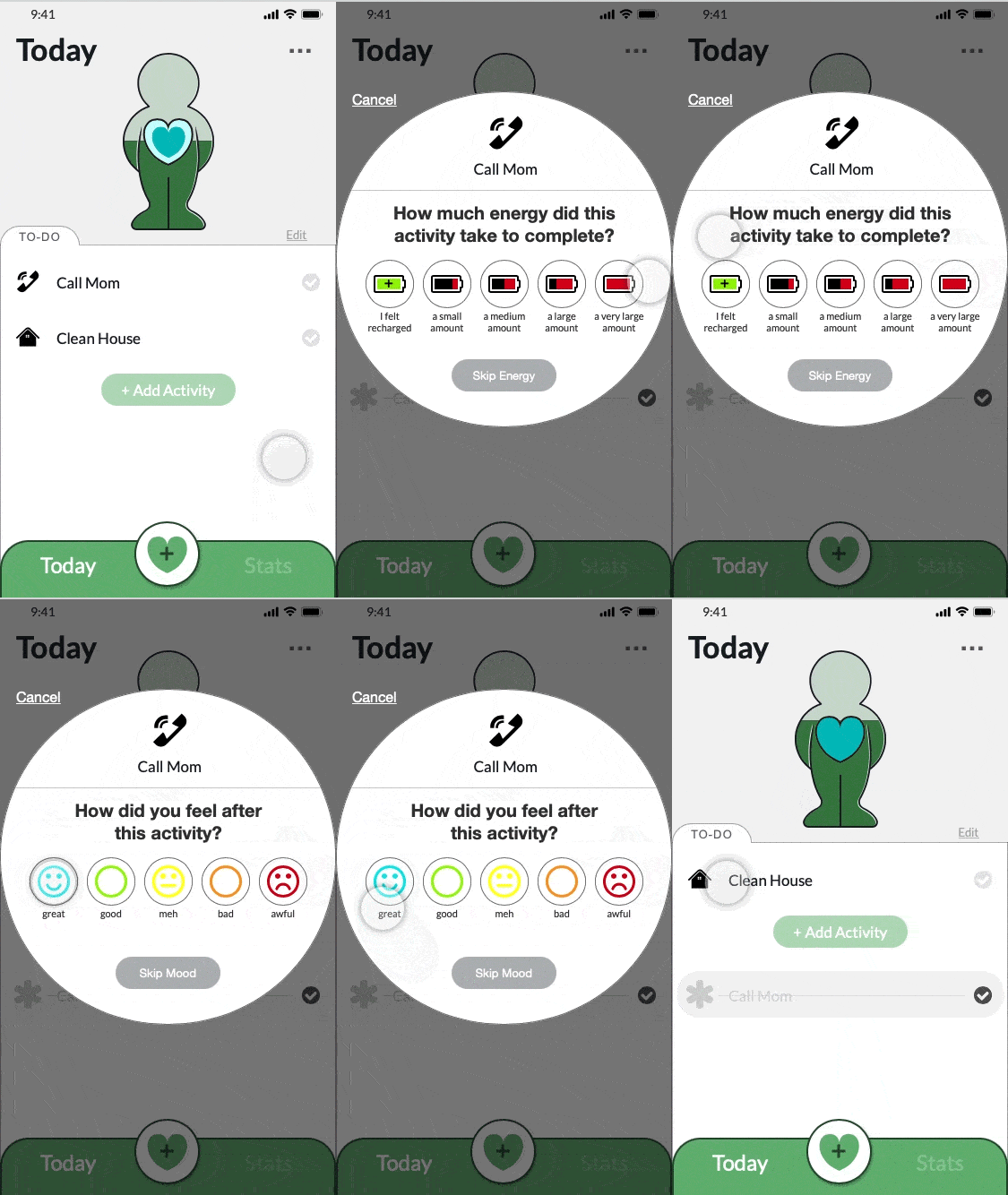
Wireframes were further developed into a MID-FIDELITY PROTOTYPE with the purpose of testing with real humans.
A TEST PLAN was created, along with a TEST SCRIPT, and I sought out six participants to journey with me through a REMOTE USABILITY TEST. During the tests, participants were asked to:
Once testing was complete I compiled the results and analyzed them using Nielsen's Severity Ratings for Usability Problems.
Several small issues were identified:
- People tried to click the "Person" graphic to add Energy/Mood entries
- "Entry Saved" confirmations after making an entry went unseen
- "Energy" and "Mood" were initially lumped together
More serious issues also came to light:
- Participants perceived the "+Add Activity" button to be disabled
- Certain options in Activity Reviews caused confusion
But the most crucial discovery:
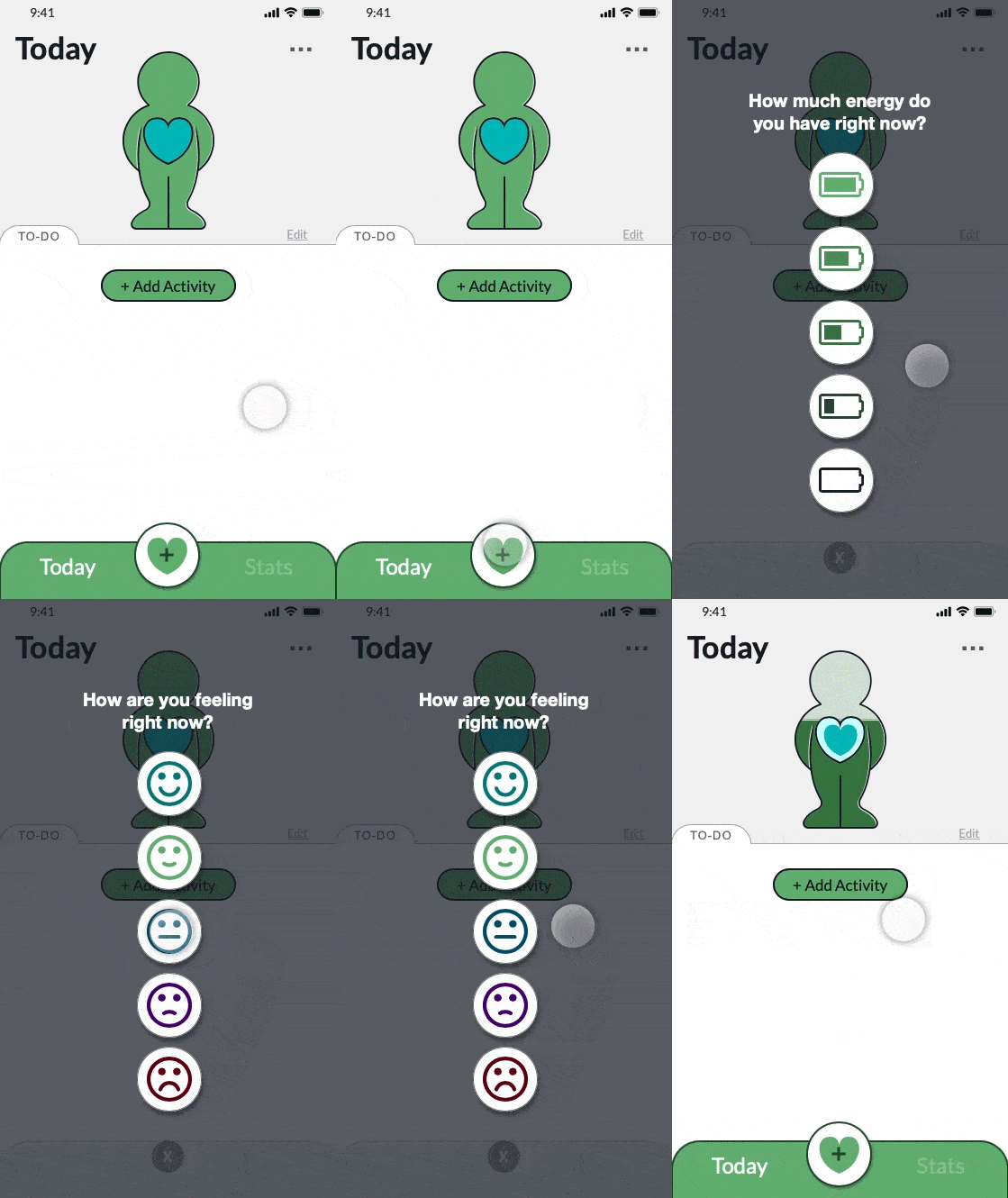
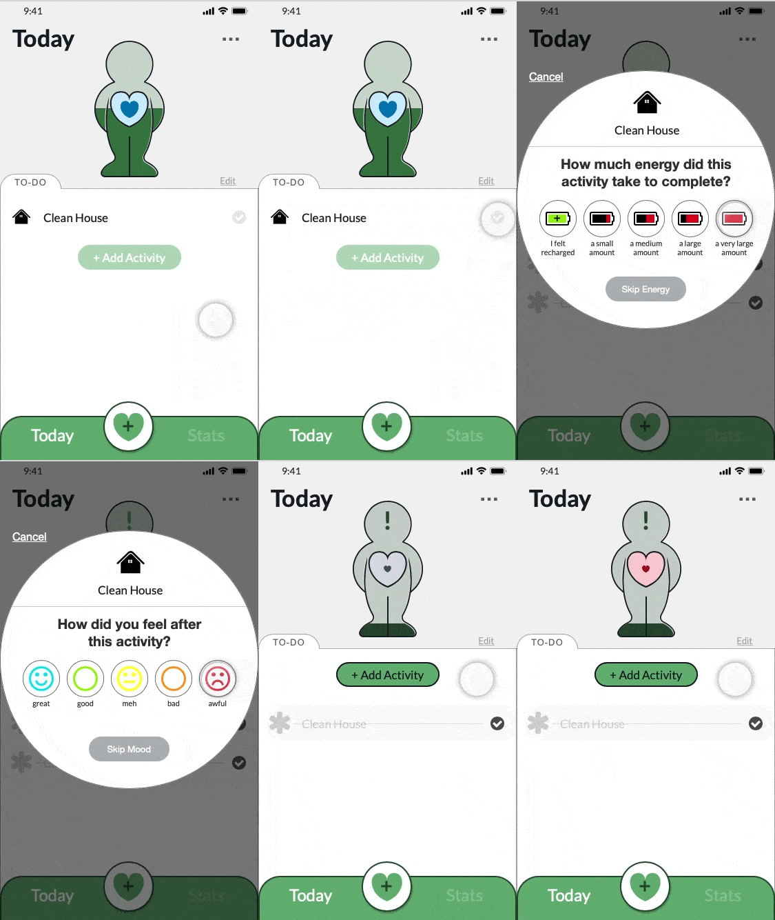
- Participants demonstrated a heightened emotional response to changes in the Energy/Mood meter graphic
5 out of the 6 participants communicated strong, negative feelings when they saw the meter fall, and positive feelings when the meter went up!
Soul Units needed to encourage growth in the people using it—not reinforce negative feelings. Special care needed to be given to redesigning the way a user's energy and mood were displayed.
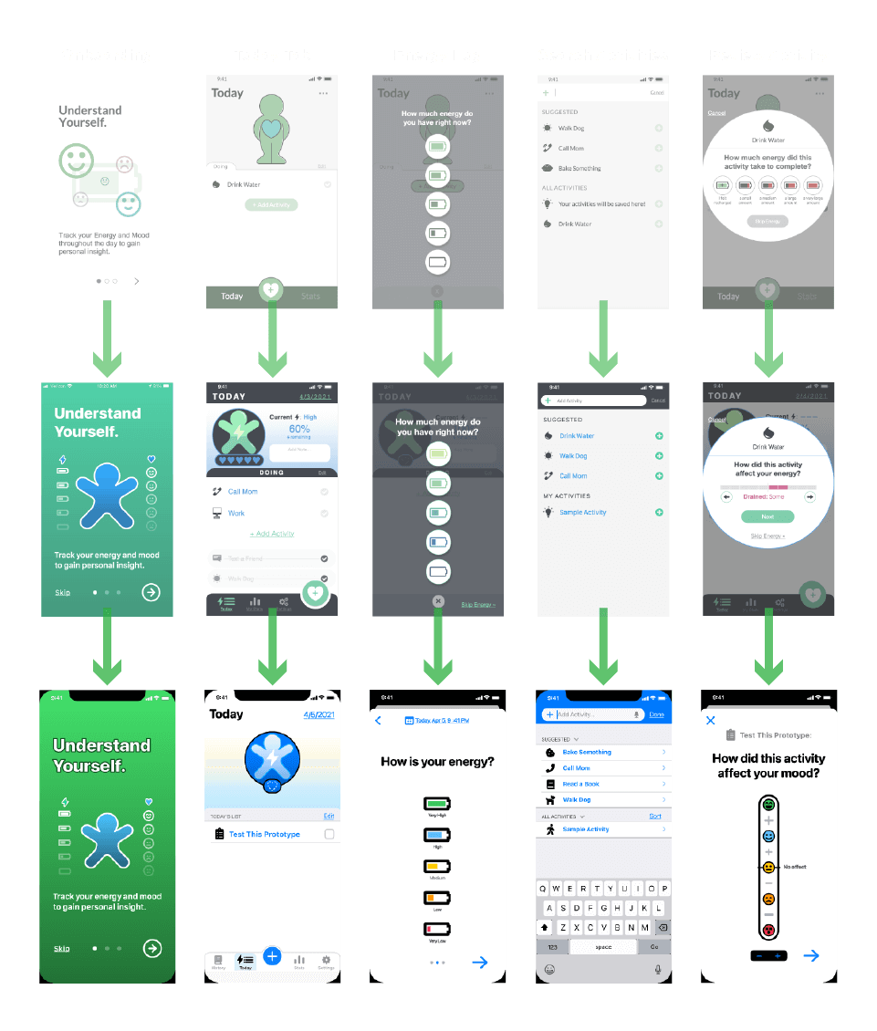
Several more rounds of the IDEATE > PROTOTYPE > TEST process were needed to address identified problems and refine the design to a satisfactory level.
After several iterations and a series of tests, usability issues were resolved, and the overall feel of the app was adjusted to be more positive and light.
Most importantly, the meter graphics within the app were redesigned to show an increase after the completion of activities, rather than echoing back to the user their current energy and mood levels.
Chapter 3
Pass It On
Tell Story • Present
The time for final refinement of the USER INTERFACE DESIGN had come, and just because this was a solo project, it didn't mean I had to go it alone.
If test participants could provide valuable insight into the function and usability of the app, finding some extra eyes to critique the UI could only be a positive endeavor.
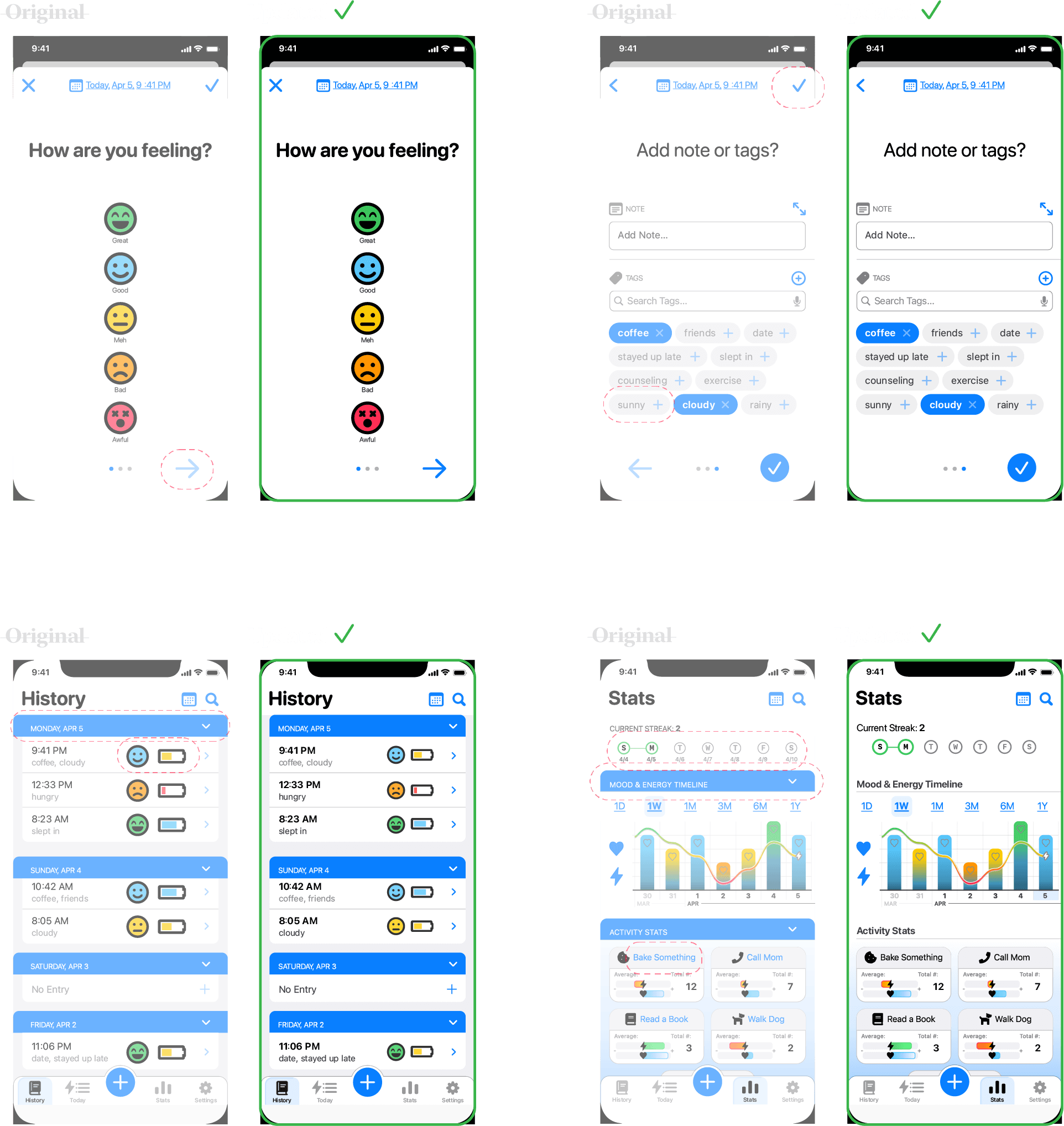
My focus for this DESIGN REVIEW was to discover ways to increase usability, as well as ensure the design was compliant with current accessibility guidelines.
Consulting with peers in the design community, I received feedback that helped me upgrade the USER INTERFACE DESIGN of Soul Units.
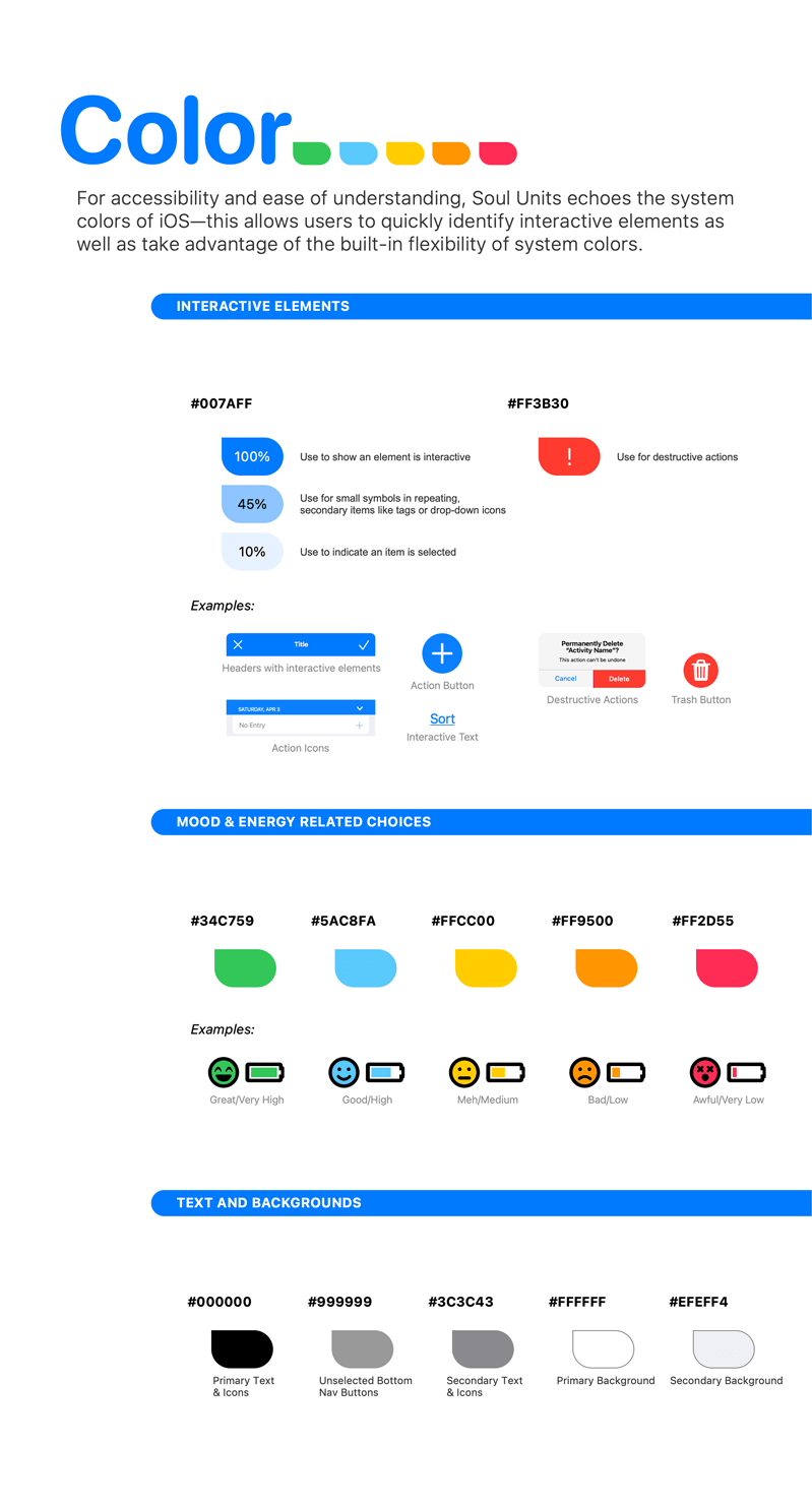
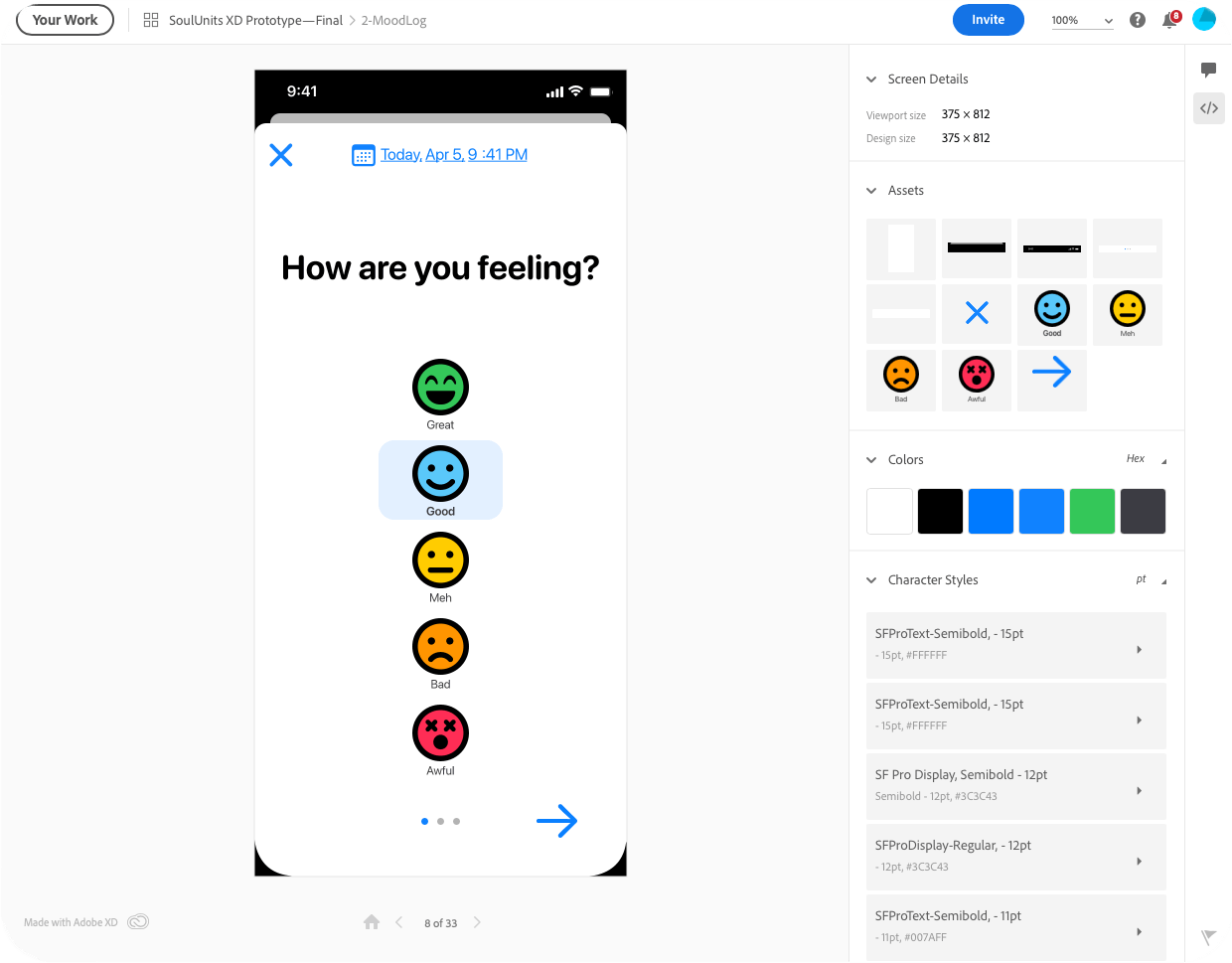
To ensure consistency in future iterations of the application, it was important to craft a DESIGN SYSTEM to communicate Soul Units' essential qualities to those that would pick up the project after me.
Epilogue
Always Learning
Soul Units was the first time I designed an app from concept to completion, and I grew in many ways throughout the journey. My greatest takeaways from this project are:
1.) Parameters are a project's best friend
The clarity gained in the research stages of the project provided essential boundaries and helped me avoid wasting my time exploring dead-ends. My personas felt like a compass that helped me stay pointed in the right direction.
2.) Anything is possible, but not everything is necessary
I truly loved the ideation and prototyping stages of this project—it was so fun to dream up solutions to problems and see them come to life.
There were however, times that I realized I needed to focus back on the essential product—extra features can always be added after launch!

3.) People are awesome!
From the initial interviews, to the usability testing and design critique—the people who helped define, test, and refine this project had a profound impact.
I am grateful to all who lent me their time and energy to make Soul Units what it is!
